CBWA Q&A: The work that stood out – creatives share their top picks before the PADC Awards
The 2025 PADC Awards are just days away, bringing the industry together to recognise the work produced over the past year. To spark some early conversation, CBWA asked a group of Perth creatives to nominate the campaigns they felt were worth noting, 9News Perth’s and also for an overall impression on the creative landscape in Perth this year. Their selections reflect the ideas, craft and thinking that stood out to them.
The questions
1: What ads/campaigns are your favourites to do well at the PADCs?
2: For an overall impression – Do you think it has been a good year creatively for the Perth industry? And has it been a good year creatively for your agency/company.
Josh Edge, Executive Creative Director at Anthologie:
1. I’ve given up trying to do punting on odds for awarding the work – gambling is a young person’s game (and, according to Wildlings, likely to get me shit on with rainbow Paddle Pops). So I’ll skip the ‘most likely’ and jump straight to ‘what I personally liked that might not get anything but I thought was great:
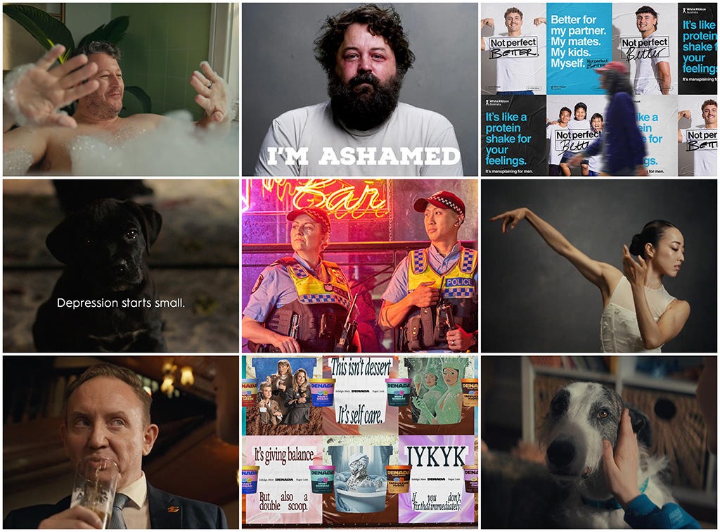
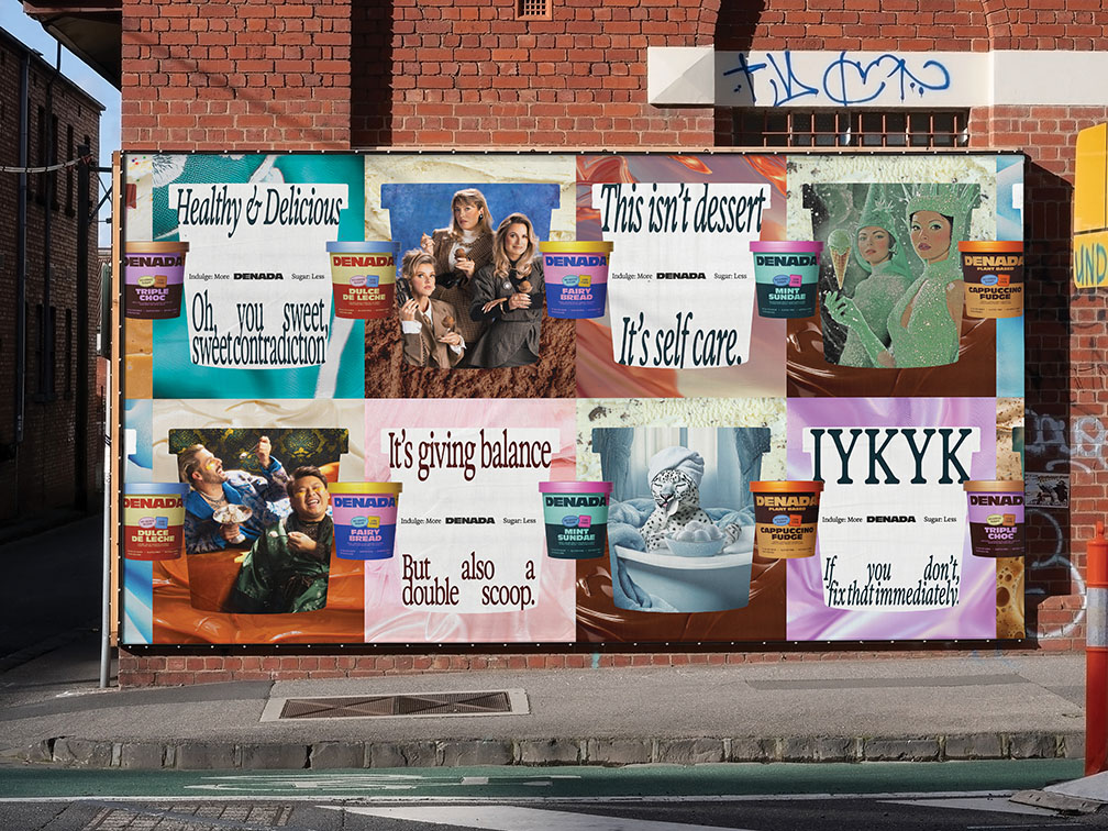
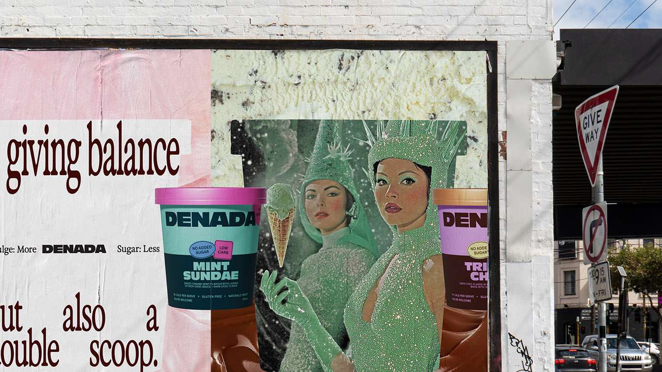
Block’s Denada work was probably the first thing to genuinely take me by surprise this year – it didn’t look or feel like anything out of Perth in a long while. The green Statue-of-Liberty-meets-Jodorowsky’s-Dune outdoor was worth the price of admission alone.
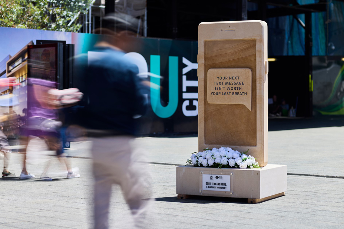
Road Safety Commission has the be the creative client of the half-decade. Reams of great work, including the Txt Tombstone sculpture that was my personal highlight.
The Start is doing really interesting things lately, and adding Travis Weerts to the mix is an interesting move. I LOVED the new RTRFM site – finding replays of my kids’ graveyard shift shows is now easier than ever (Shoutout Finn Edge!)
Speaking of Trav, his project for ozz.fm has been years in the making and is one of the most exciting creative AI/music mashups I’ve seen out of WA. Likewise his mad Cancel Spot*fy Fitness App. Just endlessly inventive and representative of small town city/big time thinking that we need more of. Follow his posts on Linkedin for more.
303 MullenLowe’s ‘Push Up Challenge’ actually made me think about doing a push-up, briefly. Thankfully, the moment passed and I celebrated with a cold beer.
Gatecrasher’s ‘Not Worth the (beeping) Risk’ is yet another example of WA’s ability to enhance a solid gold insight with beautifully simple craft in the social change space. Loved it, and kinda identified with it if I’m being brutally honest.
Berlin’s ‘Taking the Piss’ was definitely the ‘ad I saw most of outside of our industry bubble’ and genuinely had real life conversations about with real life people. If that doesn’t win high I’ll be annoyed.
Marketforce did some really nice work for WAIS with ‘Postcodes’ for the Olympics/Paralympics that deserves a shout-out.
And ‘Cockatune’ from Wildlings was great. Being married to an Enviro Scientist, I know that’s a bloody hard brief and a tough crowd to convince. Good job.
2. Perth is rock solid. The fragmentation of the industry and the local market has led to a lot of hungry, talented senior people who have shaken off the atrophy of a post-COVID, network-agency-merger malaise, and are ready to rock ‘n roll. I’m excited for everyone in the industry right now – the next few years are going to be something to see as the indies and network try to prove their value against a growing in-house client offering and production/media companies entering the creative space.
Anthologie had an incredible year, with some really important work taking space in the local and international market. Our headliner was Impact Global Health’s ‘Evidence for Impact’ Policy Design and Immersive Experience. You can see the Case Studies for the launch in Geneva and the overall brand redesign if you’re like me and always asking “What the hell is THIS thing?”. Trust me, it’s a game-changer for global health research and policy design in a post-USAID world. The recent Good Design Awards also recognised our work on NeuroHub, built in collaboration with ECU’s Centre for Precision Health and every major neurological partner in WA, which is an incredibly exciting platform for the over 1 million West Aussies with a neurological disorder.
Personally, I was also proud to be part of the team that rebooted The Equity Project as No Place for Poverty – Alex Hughes and the team is doing incredible stuff in the policy advocacy space for WA Poverty. And they’re a gold standard of a client that actually took an internal comms/design document and ACTUALLY used it to change their organisation!
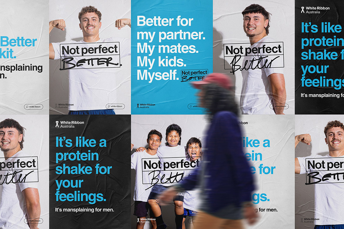
Last, but definitely not least, White Ribbon Australia’s ‘Not Perfect, Better’ platform and creative work was an awesome chance to flex the creative muscles and do a genuine brand campaign (and ads!) again. Loved the radio, shout out to Matt Dixon for making us looking amazing on the shoe-iest of shoestring budgets. Lovely guy with a big heart.
Liz Hammond, Creative Director at Rare:
1. I loved the tried and true approach of a rousing song for the Saturday Lotto campaign. It felt like a timely return to the good old days of advertising. And then the Denada work from Block took nostalgia in a different direction and somehow made it simultaneously retro and deliciously fresh.
2. From a Rare perspective – it’s been a solid year for creative output. We’ve produced lots of work that we’re extremely proud of, although that often needs the “in the circumstances” disclaimer attached to it. We’re excited to be branching out into new categories and we’re enjoying the benefits of a reformed agency structure and approach – so it will be interesting to see if that’s had an impact in the eyes of the judges.
Neil Martin, Head of Art at Wildlings:
1. Save Wild Tigers – “Ray the Rug Winstone” Ray Winstone voicing a tiger-skin rug should not work. It does, because the team commits to one idea and crafts it to the hilt. Performance and sound design carry the weight without preaching. It is dark, disarming and global in ambition, yet proudly Perth in its leadership. That mix of courage and finish is what awards are for.
The Headstone Phone A two-metre headstone shaped like a phone, placed where people cannot ignore it. Single-minded, physical and uncomfortable in the right way. The line lands. The object does the talking. It feels like an idea that will live beyond the flight and earn coverage because the public will photograph it. Simple, brutal, effective.
And St John WA’s “Dis Location” Smart outdoor that teaches as it sells. The wordplay is memorable, the system is scalable, and the behaviour change is clear: now I know what urgent care treats and where to go. Good craft on a tight brief, and properly useful to the community.
These all show the kind of thinking and craft that deserves a bit of metal on the night.
2. Perth is a small market with big scrutiny. Getting brave ideas through the line here is hard, so credit to everyone who shipped real thinking this year. The trick is to stay relevant, take silly seriously and look for the angle no one else is seeing. That’s where the good stuff hides.
This year’s work shows more Independent agencies backing ideas with real craft and confidence, which is great to see.
At Wildlings, we’ve had a strong year and we’re still hungry. We push the work until it feels fresh to everyone, not just the people in the room. Our entries this year span Perth Animal Hospital, Short Back & Sidewalks, Brightwater, Vinnies, Horizon Power and a few others who backed bold thinking.
Amber Martin, Managing Director & Co-Founder at Hypnosis:
1. I love Berlin’s big gas is “Taking the piss” work. It’s beautifully crafted with great casting, excellent performances – it was just really well made. I hope it takes home a few.
I really like Start Digital’s RTRFM website. I think it can be hard to do websites well, and I absolutely love this one. It feels true to the station – alive and full of personality. So for the digital and maybe design categories I think this could do well.
I also like the “Gonorea? Gonnoreha? Gonorria?” OOH work from Rare. It doesn’t shame anyone and instead finds a human truth: Gonorrhoea is impossibly difficult to spell. I also bet the good thing about working on this campaign was not worrying if you had a typo in the headline.
It’s a shame the “If it bothers you, Ashley and Martin” work doesn’t qualify for this year’s awards. The gross peanut butter scene is seared into my brain so I am sure it will still be top of mind for next year.
I know there is lots of other lovely work I am forgetting that will get recognised and I can’t wait to see all the winners.
2. I think it’s always hard but Perth’s creative scene does feel like it’s got some wonderful momentum, particularly with the rise of the indies. Clients are backing independents not because it’s trendy, but because the work is more ambitious, and the relationships are more collaborative.
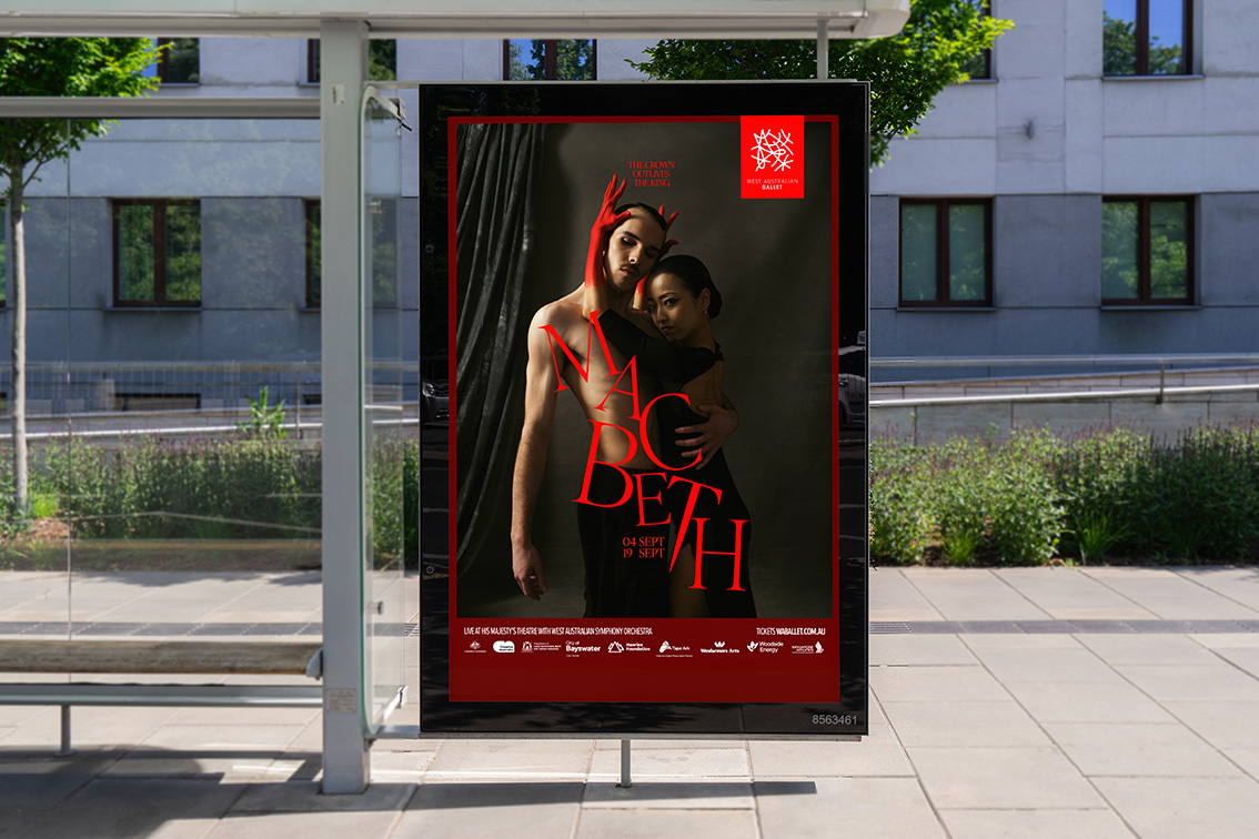
At Hypnosis, it’s been a year of big wins. We’ve won Chicken Treat, Harvey Beef and the West Coast Eagles, to name a few. And we launched our new work for West Australian Ballet, which is already delivering record sales. We also grew our research initiative, the Empathy Lab, that digs into the cultural undercurrents shaping WA. It’s been a busy time for the Hypnosis gang and we couldn’t be prouder.
If this is what the next generation of Perth creativity looks like, brave and collaborative, we’re here for it.
Katie Pelosi, Senior Creative at Block:
1. As a brand designer, I love seeing every touchpoint of a campaign thoughtfully considered. Hypnosis has done just that with their work on the West Australian Ballet’s 2026 campaign. Stunning photography, videography, typography (all the “graphy” words), where each visual element is assiduously crafted to emulate the precision and grace of the performers themselves. And is ‘Ivy Preston Display’ printed in a SPOT colour on the print collateral? I love the attention to detail.
Another memorable campaign for me was KWP & Partners’ “Half Fixes Don’t Cut It” for Ashley & Martin. The muted, retro setting is subtly melancholy but warmed by soft lighting, distinctive camera angles, and then paired with quirky, yet obliquely uplifting music that gives the whole ad an offbeat charm. Overall, it’s raw, beautifully crafted, and honestly made me grimace, which says it all.
Lastly, I’d like to acknowledge Chapter Brand and Nativ Design for their powerful “We Believe” campaign for the Centre for Women’s Safety and Wellbeing. Domestic violence is a difficult subject to confront and one that’s close to my heart. The lines “Believe me”, “Believe in us” and “We Believe” are a simple and yet powerful play on words. The black and white palette is stark and striking, conveying the seriousness of the topic as well as the enduring strength of survivors.
2. I’m ever the optimist and I (mostly) like a challenge, so I tend to think every year is a good year in the creative industry. Irrespective of the industry’s landscape or organisational highs and lows, everything we do boils down to creative problem solving and often, the more challenging a brief or environment, the more surprising and delightful the result.
At Block we’ve had a lot of highlights this year, including Kitchen Warehouse’s Wolstead rebrand and packaging project, which saw a 50% increase in sales, making it as effective as it is elegant. Kimbara Pardoo Wagyu Corporations branding and Juluwarlu Group’s “I came around in circles” art book for Wendy Hubert are also notable mentions.
For me personally, Denanda’s “Indulge more: Sugar Less” brand campaign was a definite standout. The creative breaks through stereotypical minimalist trends to create a campaign that embraces visual overload and is a testament to the weird and wonderful. The campaign not only stands out from the crowd but also cleverly encapsulates Denada’s philosophy of guilt free indulgence.
René Migliore, PADC Patron and Managing Director at 303MullenLowe:
1. I really loved the work by Anthologie for White Ribbon Australia. Presenting such a grounded, simple and relatable message was like taking in a deep breath of fresh morning air at Cott Beach. From one man, father, husband and mate – thank you. Its complete lack of pre-tense gave it incredible cut-through in a sea of brands propped up by puffery. I hope it shows up at the Skulls, but regardless, I’m just glad it showed up for men’s mental health.
2. It’s felt like a really strong year creatively across Perth. The breadth of ideas, tone and craft has been exciting to see. There’s a quiet confidence about the work being made here right now. It also feels like there’s been a theme of ‘new chapters’ this year with new agency and client partnerships forming, new brand platforms launching, new in-house teams and new agencies (of all kinds) starting up. Clearly, the ongoing challenge of relevance and purpose in the wave of tech revolution and competition, continues to manifest the work being made and the way we make it.
At 303 MullenLowe, it’s been an amazingly eclectic year. From ancient exhibitions for WA Museum to fresh brand work for Pentanet and everything in between. Saturday Lotto has been a standout, as has the new national platform for The Push-Up Challenge. We’ve helped DFES recruit firefighters, brought Fremantle’s International Street Arts Festival to life, and gone deeper into strategic projects that have challenged and rewarded the team in equal measure. It’s been a year of variety, ambition and creative stretch. Exactly how we like it.
Zoey Portilla, Graphic Designer at The Brand Agency:
1. I’ve got to give a shoutout to Gesture Systems. Whatever they take on, they absolutely nail it. Their work for Cactus Jack and Nike Tokyo is next level – especially the interactive magazine for the Air Max Dn8. It’s just effortlessly cool and beautifully executed.
I also really liked Wildlings’ Short Back & Sidewalks campaign. A simple haircut can be life changing, and they captured that message in such a genuine, powerful way.
2. Perth’s overflowing with talent right now, and there’s been a lot of work that feels fresh and well crafted. With new energy coming into The Brand, especially with Ali Shabaz stepping in as ECD, it feels like the start of an exciting new chapter. Big things ahead for The Brand Agency.
One project that stands out for me is Life Saving Stickers for the Road Safety Commission – maybe I’m a bit biased because I got to work on it. It’s an always-on campaign about getting people to think twice about how they drive. It’s such a simple idea but with a really big purpose. Road safety’s something I care a lot about, so being part of work that actually helps people means a lot to me.
Bryan Dennis, Executive Creative Director at KWP+Partners:
1. Listening to the latest PADCast with Chair of Judges Dr Sinead Roarty over the weekend, I found myself playing the usual pre-PADC guessing game, trying to match their cryptic judging-room comments to actual pieces of work. Short answer: no clue. They were impressively vague.
What I can say is the work that’s genuinely stuck with me from the past year is wonderfully varied. Rare’s “The Black Puppy”, Gatecrasher’s “Not Worth the Beeping Risk”, Wildlings’ “Short, Back and Sidewalks” and VML’s Hellmann’s OOH all feel like they’re metal-worthy. And I’m weirdly excited to see the EDM Sinead was alluding to.
2. For KWP+Partners, backing up something like “Cop Enough” is always a daunting task. But what we do have this year is a broader spread of work I’m just as proud of. Particularly RSPCA “This is Love”, MACC NT’s “Lives Worth Living”, and The Kids “Think of the Kids”, which all were important briefs that pushed us creatively in different ways.
For Perth more broadly, it feels like a good year without quite tipping into great. I don’t think we’ve seen many big creative risks, probably a sign of economic realities more than a lack of ambition. Still, I’m hoping Friday night serves up a few surprises and proves me wrong.
Richard Berney, Managing Partner, Creative at Berlin:
1. Gonorreah? Gon- (Nope, I’m not even going to try). ‘Gonorrhoea – hard to spell easy to prevent’ kept catching my eye on the road this year. So, it passed the road test! Nice one, Rare.
I kept loving the Metronet work from Moonsail. A cute puzzle, and again, passed the Adshell road test. Super tight idea, executed with warmth & simplicity.
Perth Wildlife Hospital is super fun, ‘Cockatune’. Really nice production, great timing – I can imagine it wasn’t an easy one to get just right. Great idea, great job Wildlings.
Finally, I really loved the website design for ‘Sanctuary’, the Fremantle Biennale. It took me out of my world and into another with such immediacy! So, I don’t know whether it’s been put forward for an award, but it certainly has my vote.
Matt Sav’s music vid ‘Bawuypawuy’ for Drifting Clouds is really gorgeous, as is Luna Laure’s promo for Art Ball for the Art Gallery of Western Australia.
Oh wait, one more! I really loved the work that Hypnosis did for the WA ballet. The MACBETH poster is absolutely wonderful (with just the right amount of dread!).
2. I think the year has been really solid.
I’m enjoying the diversity of work that is coming out from a diversified marketplace. The bigger shops are still doing strong work, but now there is a broader bouquet of ideas coming from the addition of so many independent creative companies. They’ve had a bit of time to establish, and so we’re seeing the fruits of the startups in a richer WA portfolio.
We’ve had a great year. Personally, I’m really enjoying our chother (that’s Metronet for ‘each other’) – as in, absolutely love our little team! And we’ve been working hard – lots of campaign/brand groundwork. A few favs… Kitchen Warehouse ‘High Fryer’, Minderoo ‘Sick of Plastic’, The Australia Institute ‘Big Gas is Taking the Piss’, WAM’s new brand ID & Dull Co brand also very cool!
Hannah Muirhead, Founding Strategy Partner at Chapter:
1. It feels like it’s been a long year that’s gone quickly.
For me, the thing that sticks (always the true hallmark of work that works) is the Perth Festival rebrand by Hypnosis.
It takes brave marketers to refresh a beloved cultural institution, and I loved the bright yellow distinctiveness and gentle provocation of this brand platform refresh. So simple. So unmistakable. They wanted to hit a new target audience and it worked its socks off with a 62% lift in sales (that’s brand building doing its job).
I also love when campaigns that have genuinely committed to craft get recognised.
The Black Puppy by Rare, Beautiful Pictures for WAPHA is a standout. Another simple metaphor, elevated into a beautifully executed piece of film.
And the WA Police Force’s Let’s Join Forces campaign – it shouldn’t be brave to use humour, it’s actually less risky than not. Yet culturally, it feels harder than ever to get smart scripts and charm into work. Good to see they stuck to the Let’s Join Forces platform too. Creative consistency in action.
2. I think the green shoots are definitely showing. It was a weird year economically – tariff chaos, global fear, everybody cutting back. But as that shook out, we’ve started to see a renewed commitment to good design, real craft, and bold, simple platforms.
For Chapter – it’s been our first official year as a business. We’ve loved getting back to working directly with clients again. Senior people working with senior people means less layers, more direct relationships, better work. Whether creating a platform for B2B – the unsung heroes of the economy – or reawakening a once beloved destination, we’re finding this model produces richer, stronger, simpler ideas. We believe the work is stronger, the clients are happier, and we’re more fulfilled because we’re only shipping work we are proud of.
We have four new brand platforms launching in the next few months across Government, start ups and destination marketing so stay tuned!
Andrew Tinning, Creative Director at AT Creative:
1. Nothing really springs to mind that I think will sweep the boards like in previous years. And to be honest, I don’t really pay much attention these days. A few things I do remember are Gatecrasher’s Bleep campaign for Drink Driving and then there was the haircuts for the homeless by Wildlings. MITP made a really nice short film for this service as well, so I hope that’s been entered and gets a well-deserved nod. Design wise, Block should clean up once again for the consistently great work they continue to pump out – lovely stuff for PICA (or was that last year?) And Anthologie is bound to grace the stage for their work with Impact Global Health on Evidence for Impact.
2. Has it been a good year creatively? I’d hesitate to say yes. These are interesting times, which I reckon is reflected in the amount of interesting work. For me personally creative satisfaction is coming from places outside of traditional advertising and clients. I’m part of a team that received development funding for a documentary series that will deliver a powerful message with the potential for real social impact. And I’m really proud of the work I’ve been doing with the WUNAN Foundation through WUNAN Media in Kununurra, With the US Without Abuse Campaign being a particular highlight. Speaking of which I’m about to board a plane for a week’s shoot up there on something I’m very excited about. So, I’ll raise a beer to you at ‘the Kunny’ on Friday – have a great night and stay safe!
Oh and congrats to all the winners.
Register for FREE HERE and receive the Campaign Brief WA Daily Bulletin and/or the global Best Ads Best of the Week Bulletin
3 Comments
I knew there was something I forgot to mention. Best of the year – The Black Puppy from Rare.
If anyone would like more info on the Impact Global Health work, you can shoot over to the Case Study page of Evidence for Impact here: https://weareanthologie.com/project/policy-cures-research/ or just watch the pretty video here: https://www.youtube.com/watch?v=tS1tLATU_yw
Much like AT, I remembered a great piece of work after reading everyone else’s homework. Gonorrhoea was great (only time I’ll write those words), well done Rare.