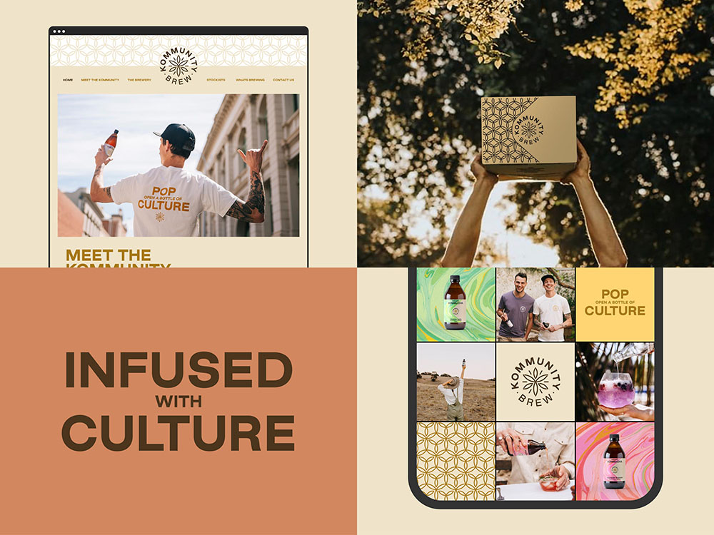
‘POP OPEN A BOTTLE OF CULTURE’: KOMMUNITY BREW UNVEILS A NEW BRAND IDENTITY BY BLOCK
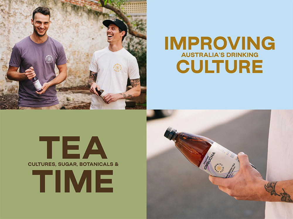
Kommunity Brew is a company on a mission to change Australia’s drinking culture by converting more people to functional beverages. It needed a brand identity and packaging design that would take it to the next level – from farmers markets to national and international supermarkets.
“Kommunity Brew came to us with their business goal: to grow tenfold in five years,” explained Joseph Dennis, Creative at Block. “They wanted a brand that drew on their roots while pushing them forwards, increasing their shelf-presence and allowing them to extend the reach and understanding of the kombucha category as a whole.”
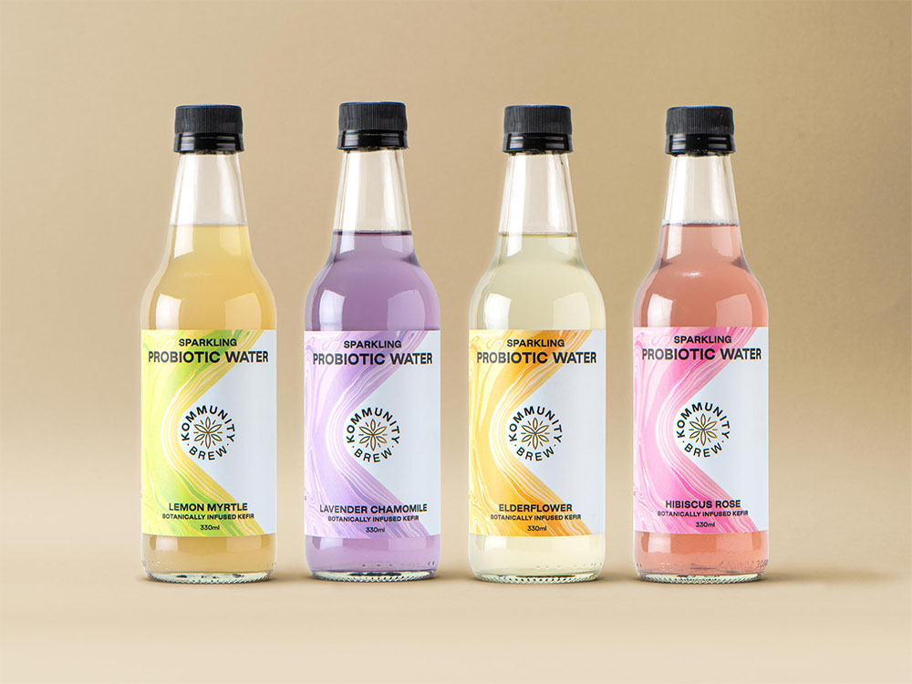
Kommunity Brew makes smaller, fresher batches of authentically brewed kombucha and kefir sparkling water. It needed to stand out in the non-alcoholic drink market, which is highly saturated, especially in the health food space where a lot of packaging tends to follow the same formula.
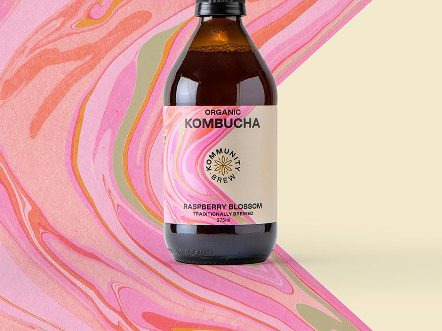
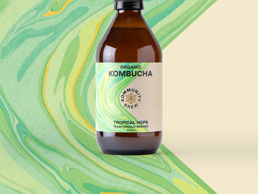
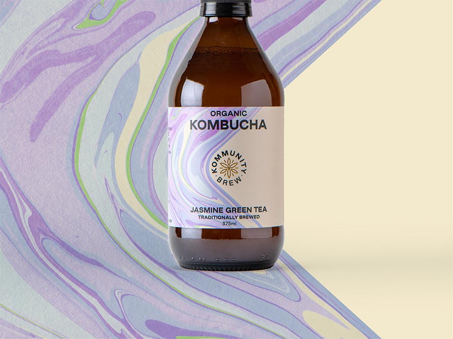
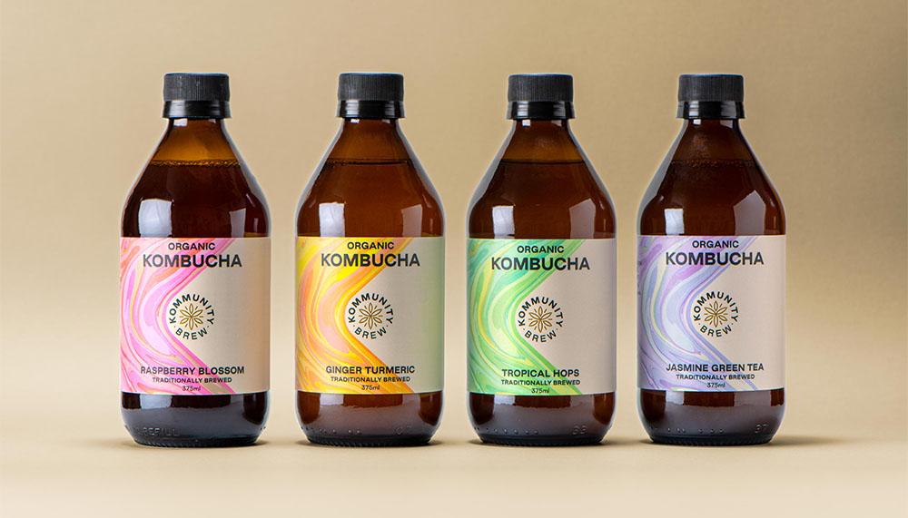
Block designed a packaging system that places the brand font and centre, shows flavour in an interesting way, while meeting the legal requirements mandated by major Australian supermarkets.
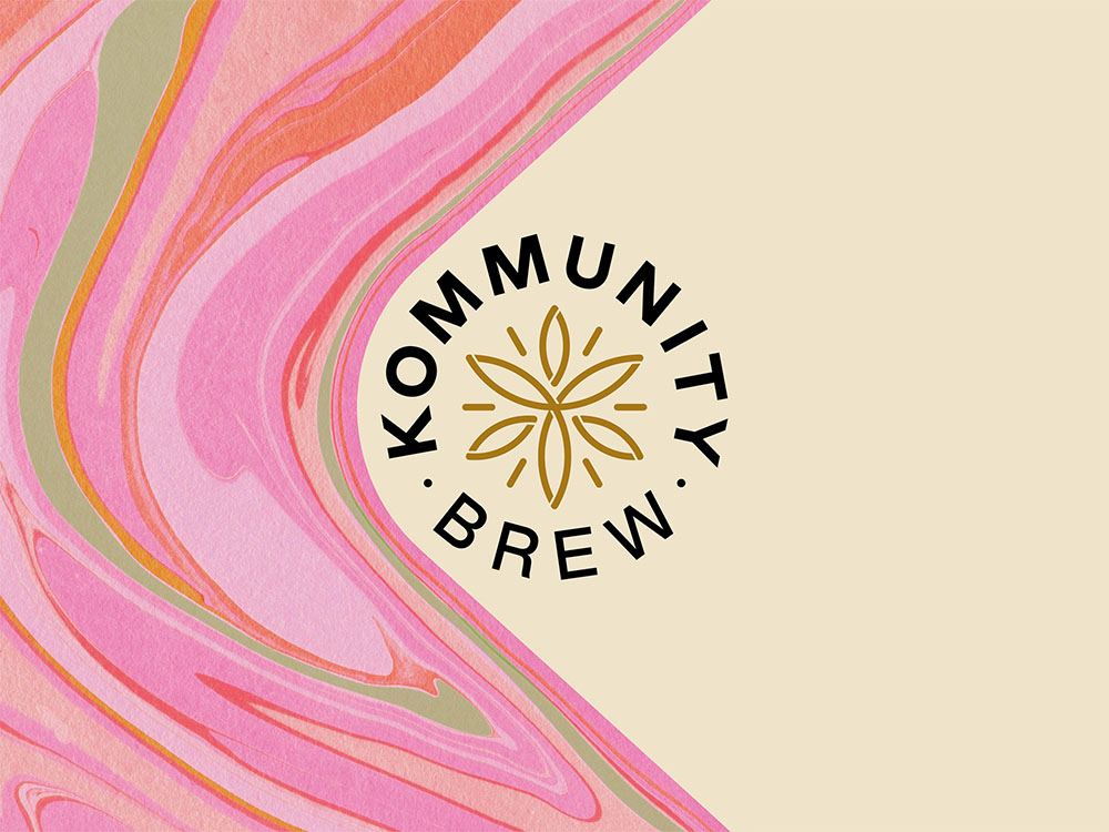
Housed within a K shape, bespoke, hand-painted marbling artworks communicate the depth, complexity and intensity of the flavour variants, visually representing the experience of tasting each product.
The artworks needed to be made authentically to reflect Kommunity Brew’s authentically brewed products. After buying specialty marbelling inks, Block’s designers realised they weren’t sure if they could replicate their digital mockups.
They spent days experimenting with inks, textures and marbelling techniques, creating huge, intricate artworks to reflect the unique flavours of each product – a slow and meticulous process.
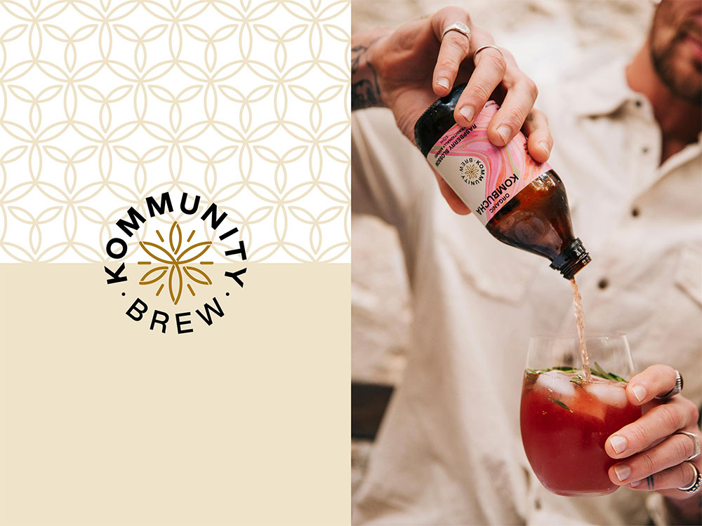
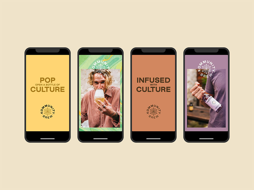
Kommunity Brew’s original brand identity is based on an ancient symbol that has become too generic for the brand to own as they grow. The founders didn’t want to let go of these origins entirely, so Block retained elements of the flower of life icon to create a brandmark that can exist independently of product labels.
It is now being used everywhere from DIY home brewing kits to t-shirts and other merchandise, positioning Kommunity Brew for growth while linking strongly to its farmers market beginnings.
Kommunity Brew’s founders are serious about their mission, but the new identity helps them to speak in a more fun, approachable way: “Pop open a bottle of culture”.
In a booming kombucha category – worth an estimated $200 million in Australia alone – Kommunity Brew is now ready to take on the world.
Client: Kommunity Brew
Agency: Block
Account Director: Jane Jones
Account Manager: Fernanda Fauzi
Producer: Jessica Richings
Creative Director: Mark Braddock
Designer/Art Director: Joseph Dennis
Typeface used: Good Sans by Good Type Foundry