Nova Boy returns to turn up the feel good in new NOVA national marketing campaign

NOVA Entertainment announced the launch of a new Nova Network marketing campaign to ‘Turn Up The Feel Good’, featuring a new look for the iconic Nova Boy brand character, that will run across multiple platforms from Sunday 18 April.
Since the Nova Network launched in the radio landscape in April 2001, accompanied by the endearing Nova Boy brand character, the brand has built a highly engaged audience, diversified across multiple platforms and has created innovative client solutions based on deep audience connections.
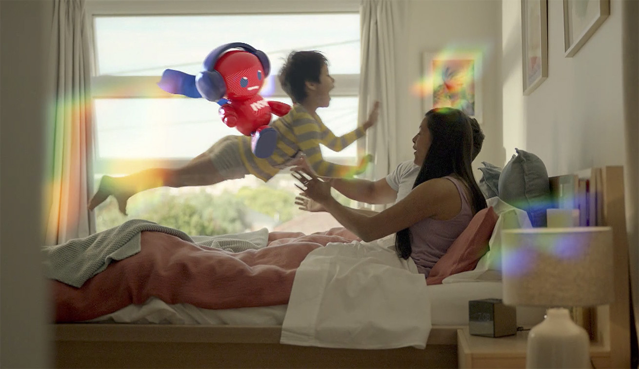
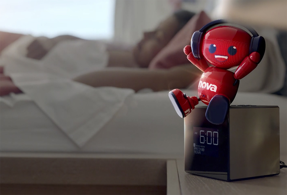
Nova’s new TVC reintroduces Nova Boy to audiences alongside the Nova Network’s much loved breakfast teams across the country and Australia’s number one drive show Kate, Tim & Joel. Set to Joel Corry’s global smash hit ‘Head & Heart’, the feel good sentiment of this hit song supports the overall creative of the campaign, highlighting Nova’s “Turn Up The Feel Good” brand positioner.
Nova Boy is an iconic and easily distinctive character that Australians still associate with the Nova brand today. By reintroducing and reinvigorating Nova Boy, the character provides a consistent driver of the Nova brand personality and a unique point of difference for the network. Production company, Red Engine have used leading 3D animation to bring Nova Boy to life in everyday moments showing audiences that Nova is always with you and always ready to ‘Turn Up The Feel Good’.
Paul Jackson, NOVA Entertainment’s Chief Programming & Marketing Officer, said: “The Nova Network has constantly adapted to the times we are in and it is an important part of Nova’s DNA to have fun, lift the spirits and make our listeners’ day brighter. This new campaign is designed to celebrate what our listeners love about the Nova brand, highlighting our point of difference through our popular announcers, a hit soundtrack and the timeless nostalgia of the highly recognisable Nova Boy character. Radio’s role as a companion has never been more evident and in this busy world, we wanted to cut through creatively by doing something different with the popular Nova Boy, to celebrate the feel good role the Nova Network plays in the lives of our audience.”
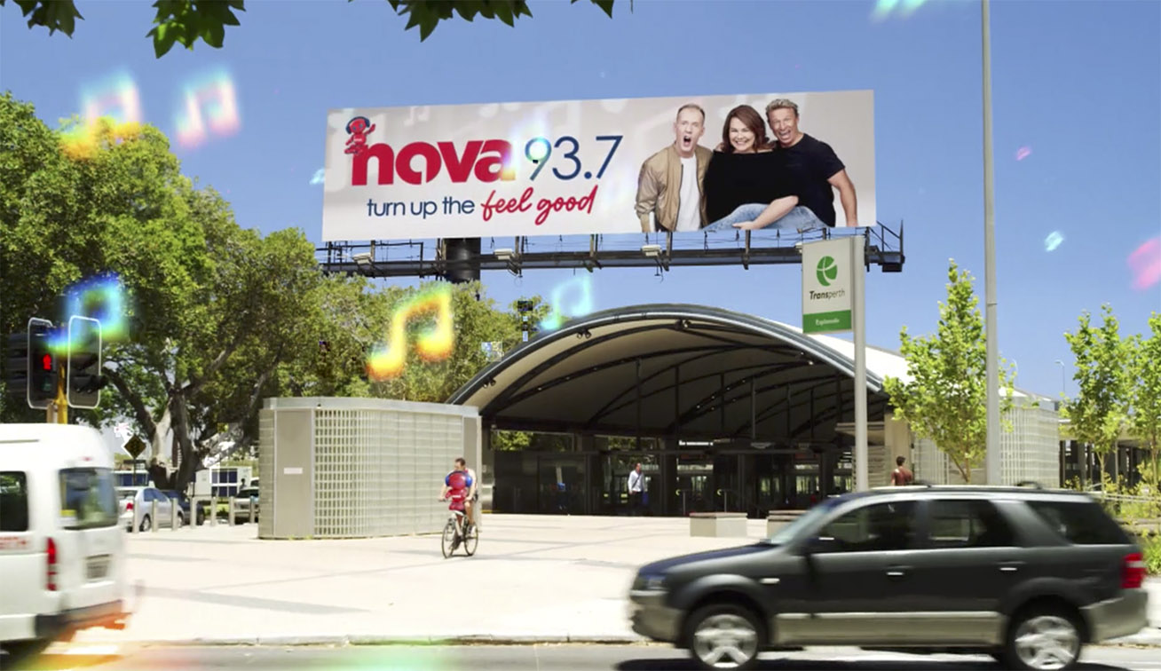
Nova’s new marketing campaign features the Nova Network’s consistent and popular breakfast shows – Nova 96.9’s Fitzy & Wippa in Sydney, Nova 100 Melbourne’s Chrissie, Sam & Browny, Nova 106.9 Ash, Kip & Luttsy & Susie O’Neill in Brisbane, Nova 93.7 Perth’s Nathan, Nat & Shaun in Perth and Nova 919’s Ben & Liam in Adelaide – as well as Australia’s number one drive show Kate, Tim & Joel.
The Nova Network’s new marketing campaign launches on 18 April with creative running nationally across TV, BVOD (broadcast video on demand), on-line video, cinema and a range of OOH platforms.
Credits
Creative: NOVA Entertainment & Red Engine
Creative and Production Company: Red Engine
Media agency: Carat
Soundtrack: Head & Heart – Joel Corry feat MNEK
Record label: NEON Records / UMA


2 Comments
RADIO LOGOREAH
Over the journey, I have consulted to and worked with all of the commercial FM stations in WA. I do not claim to be the world’s guru on this subject, but I do understand that branding is much more than a logo. Of course, as far as radio stations go, it is their sonic presence, their jox line up, their music, their promotions as well as their graphic presence which, when combined, comprise their brand.
Some have exhibited little or no understanding of this – and in particular, the design and use of their logos. If you’ve ever had to work with them, the previous 92.9 and Mix 94.9 logos were shockers. They were almost impossible to use in reversed out executions or against textured or coloured backgrounds.
During my time, I worked with Nova for about ten years, and ‘Novaboy’ was both the station and network logo before it was dumped in 2016. It is somewhat rewarding to learn that Nova has reintroduced ‘Novaboy’ albeit in a different ‘3D animated’ form than the original.
I remember a somewhat heated discussion I had with the then CEO of the network during 2016 when she was in Perth for a short visit, shortly after Nova jettisoned the original ‘Novaboy’ in favour of the name, NOVA followed by the numerals representing the frequency. She argued it was important to identify and promote the frequency. I suggested this was not necessarily the case because most tuners have ‘seek/search’ and ‘memory lock-in’ functions, especially in vehicles. I felt that the replacement logo did nothing but relegate the Nova brand downwards leaving it without any distinguishing characteristics besides the typography deployed. And typography alone (especially in this case) was singularly without any character. Or personality.
In my view, her decision removed the one outstanding element in the network’s branding repertoire. I suggested that ‘Novaboy’ was comparable to ‘Apple,’ the ‘Nike swoosh’ and ‘Shell petrol. in that it was (at the time) a highly recognisable symbol that had a strong market presence without needing to have the station’s name spelt out. The CEO simply wouldn’t accept this argument.
Editors with whom I worked on Nova TVCs in the past were often able to animate the line drawing of the original Novaboy particularly as a motion signature used to author the TVC commercials that we created, often in sync with the music bed we deployed.
Whether the new animated version of Novaboy survives, or will be used interestingly or creatively, remains to be seen. I think it is quite difficult to combine animation with live action. Good luck to them.
Nova boy could ride me like a horse any day!