City of Perth, Marketforce and Flare team up to say sayonara to iconic Perth parking meters
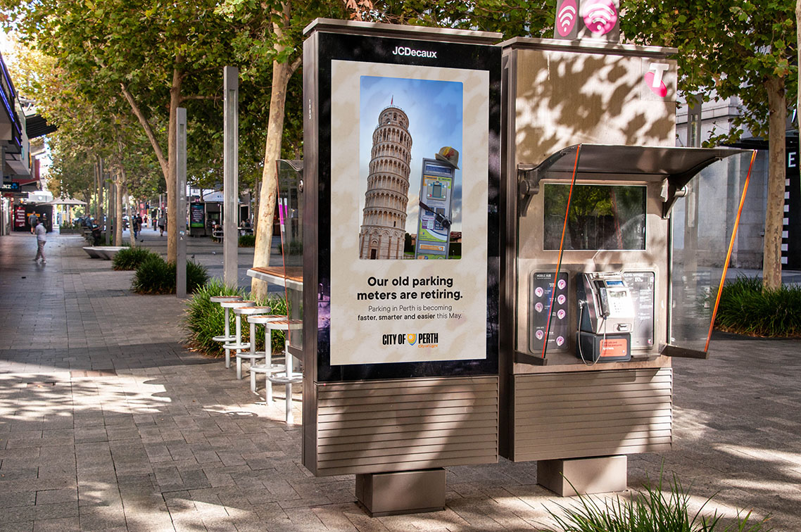
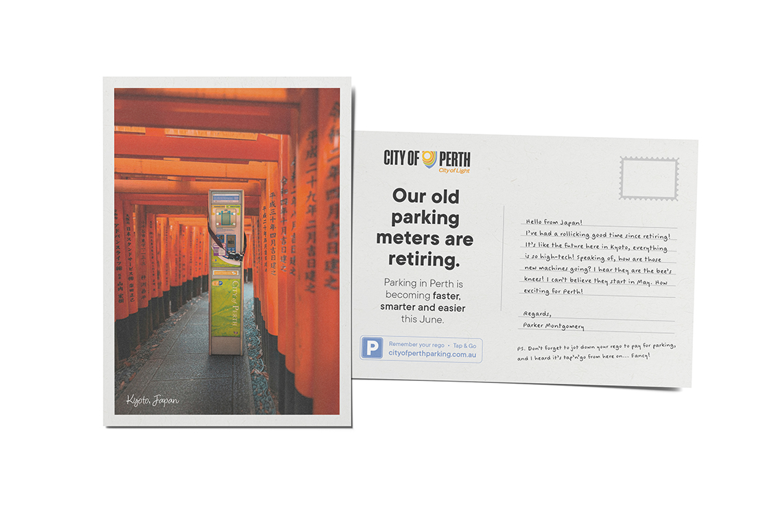
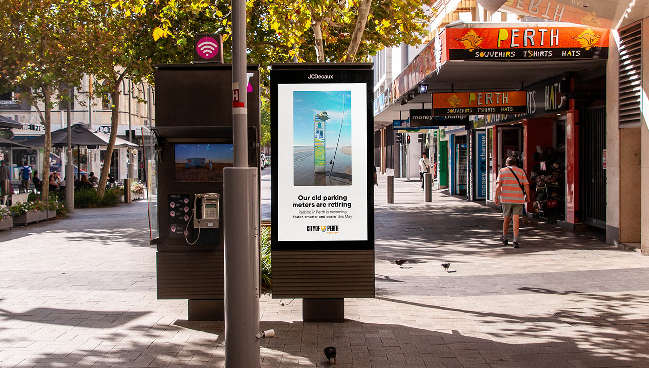
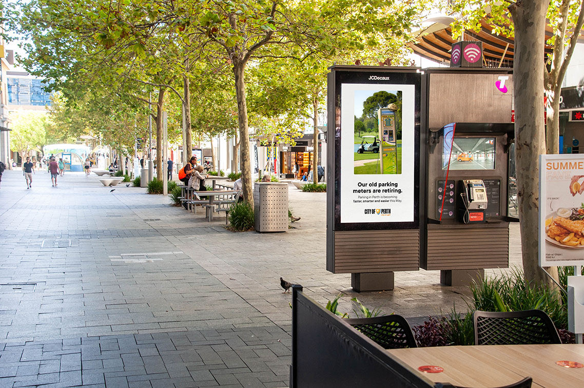
City of Perth has launched an integrated campaign to tell the people of Perth that parking in the city is becoming easier, smarter and faster. This sweet swansong to the old parking meters that we are all familiar with was created via Marketforce and Flare.
After years and years of service, The City of Perth has sent their old mates on the retirement tour they deserve. Whether it’s grey nomad-ing across Australia, enjoying the sights and sounds of Paris, or jetting over to Japan, they’ve earned it!
Marketforce, combined with photographer Luke Carter Wilton and the team at Flare to create the campaign spanning over film, print, OOH, and social channels.
Luke Williams, Associate Creative Director at Marketforce, said: “As important as the fancy new machines are, we thought it proper and right to give the old machines a fond farewell. So long and goodbye, friends.”

Credits
Client: City of Perth
Marketforce
Chief Executive Office: Adam Marshall
Chief Growth Officer: Dixie Marshall
General Manager: Craig Sadler
Account Director: Krista Song
Head of Creative: Rikki Burns
Head of Creative: Josh Edge
Art Director: Mike Dann
Copywriter: Henry Malkovic
Associate Creative Director: Luke Williams
Senior Finished Artist: Ben Mills
Flare
Head of Flare: Mason Fleming
Editor: Beth Cole
Photographer: Luke Carter Wilton
1st Assist: Dan McBride
Set and Wardrobe: Nicole Ferraro
Retouching: Luke Carter Wilton


11 Comments
Fun idea!
Who woke up Marketforce?
The Brand did this 15 years ago for The Water Corporation, with the line “Give your reticulation a holiday.” Pretty sure it picked up Best in Show at PADC.
New easier parking meters are arriving.
Lovely work all involved
Well done MF and Flare
Nice work MF!
FUN. LOVE IT.
Ok so this is for the same brand and advertiser as the dancers ad just launched, but had no common elements. No consistency. Nothing aligned with the proven way to build brands and deliver effective ads. Start again from zero. These are shiny ads yes. But nothing about building out effectiveness.
These are great, put a smile on my face and a simple message explained clearly.
I don’t know, Sciencetist, this is a campaign from a different city sub-brand, doing what it needs for that communication strategy. I can’t think of any multifaceted LGA/State/National tourism destination marketing approach that has a truly single-minded creative proposition across all their campaigns – as the individual campaigns, audience, and need-state/content remits are so different. House of brands etc.