Brightwater recognises older West Australians’ lifetime of housework via Wildlings
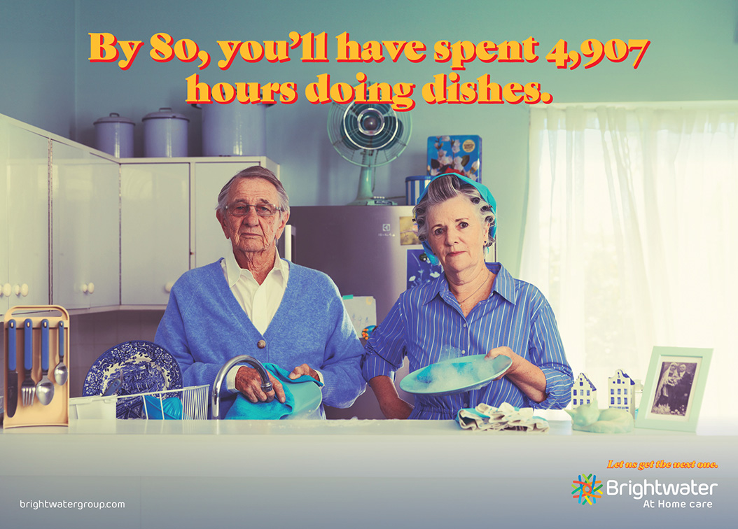
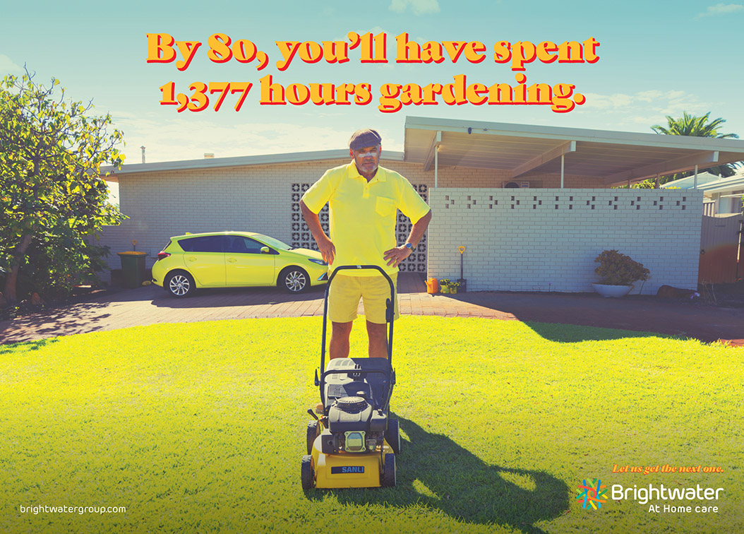
Brightwater At Home has teamed up with Wildlings to launch new campaign – Let Us Get the Next One. This tongue-in-cheek concept pays homage to the hard work and dedication of older Western Australians, highlighting the thousands of hours they’ve devoted to menial household tasks—equating to around 8 years or 10% of their lifetime.
Through quirky storytelling and engaging retro-styled visuals, Let Us Get the Next One sheds light on the often-overlooked efforts of older adults – challenging the stigma sometimes attached to accessing aged care services.
Andre Rauch, Marketing Manager at Brightwater, said: “The campaign’s comedic approach brings a breath of fresh air to a category that’s usually seen as serious. We want to connect with audiences in a more relatable and entertaining way, prompting them to rethink their views on housework and aging.”
Matt Wilson, Creative Director at Wildings, says: “Brightwater have really engaged with the creative process and sought to challenge the often sterile advertising that we see in this category – hats off to the team.”

The campaign launches today across various media channels, including TV, digital, print, OOH and social media.
For more information about the campaign and Brightwater At Home services, visit Brightwater.com.au
Play the “Gardening”, “Supermarket” and “Kitchen” radio spots.
Credits
Brightwater
Client Manager: Andre Rauch
Marketing Advisor: Morgan Eales
Wildlings
Creative Partners: Matt Wilson & Pat Lennox
Head of Art: Neil Martin
Client Partner: Cait Totten
Senior Client Manager: Alicia Gould
Sandbox Crew
Director: Robert Woods
Senior Producer: Kelly Marie Miller
Producer: Madison Armstrong
Production Assistant: Jay Peardon
Stills Photography Assistant: Xavier Jansen
Production Designer: Jessica Wilson
Art Department PA: Jack Gilmour
Director of Photography (DP): Raz Mahmudul
1st Assistant Camera (AC): Lauren McDonald
On-set Sound: Jake Isard
Gaffer: Daniel Collins
Stills Photographer: David French
Wardrobe Stylist: Jessica Wilson
Makeup & Hair (H/MU): Melissa Clarkson
Location Scout: Shannon Hicks
Casting Director: Shannon Hicks
Photographer: David French
Sound: Brad Habib
Talent
Shopper: Deanna Nishi
Brightwater Employee (Supermarket): Karma Dhendrup
Lawnmower: Peter Metropolis
Brightwater Employee (Lawnmower): Donnalee Gouge
Dishwasher Wife: Anne Neal
Dishwasher Husband: Bill Neal
Brightwater Employee (Dishes): Dharvi Chaudhary


17 Comments
Nice
Cut through creative but I fear that the consumer benefit has been buried.
Really refreshing work and a nice insight.
Love the casting too.
I really like this. Super fresh for the category.
Outstanding for the category.
Love the art direction!!
The goggles do nothing!
This is fresh. Like Dav says, outstanding for the category.
‘Fresh for the category’? Sure. Right for the audience? Absolutely not. The insight is great, but the execution feels like a 90s midjourney mashup. Boomers only live in a fantasy world figuratively. And they’ve never seen a Wes Anderson movie.
I can’t read that font. Your audience has no hope.
Agrreeee. But let’s not start mistaking interesting facts for insights.
The facts aren’t interesting at all, but the insight that ‘you’ve done enough, let us get the next one’ is great. The execution just misses the mark entirely.
The haters can’t help but talk about every Wildlings campaign.
Well done on securing Brightwater as a client and congratulations on the first of many new campaigns. This is really fresh and compelling work.
There’s an idea here for sure… “you’ve done enough….” But check out the guru of insights himself Jeremy Bullmore for some insight on insights.
Well done Brightwater. This is so fresh and unique. Bound to cut through. When the market zigs, zag.
Poor form once again, yet another article with a huge credit list but post artists get left out.
Who did the edit? Who did the graphics? Who did the grade?
I love the idea and Wes Anderson direction, but has anyone with accessibility experience been involved here? That’s got to be the harshest font, in the harshest colours to read, that I’m not sure the target demo will be able to see a single headline.