New branding launch lights up what is unique about the City of Perth

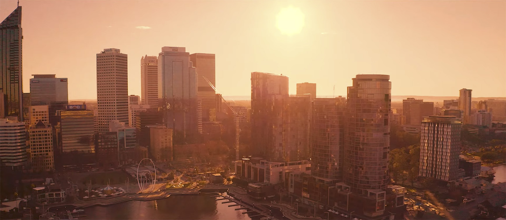
Perth’s Indigenous culture, unique landscape, and reputation as the ‘City of Light’ have been captured in a new brand for the City of Perth.
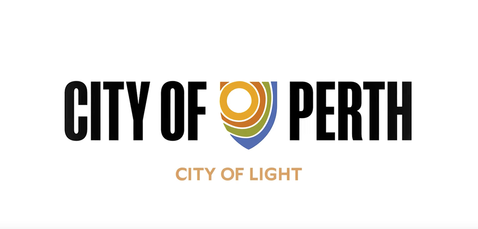
Officially launched to coincide with the City of Light drone show, the brand work includes a new logo for the City created by local agencies Nani Creative and Block Branding, with guidance from the City of Perth’s Aboriginal Elder Advisory Group.
The indigenous-inspired logo features heavy inspiration from Perth native surrounds including Ngangk (the sun), Kaarta Gar-up (Kings Park), Moodjar Tree, Banksia, Kangaroo Paw, and Derbarl Yerrigan (Swan River).
City of Perth Lord Mayor Basil Zempilas said it was time to create a brand that highlighted what was unique about the City of Perth.
“We saw an opportunity to create something that symbolised our diverse communities, unique landscape and rich history,” Mr Zempilas said.
“A strong theme of light underpinned the brand work and was a common thread in community consultations on the brand hosted by the City last year,” he said.
“Light, quite literally, put Perth on the map when the people of Perth lit up their homes and businesses, as astronaut John Glenn flew over Perth during the Friendship seven orbit around Earth,”.
“It’s fitting that we launch the new brand for the City on the 60th anniversary of that event. The “City of Light” represented “everything Perth is and everything we want to be. Light is action, it’s safety, it’s ideas, it says there’s something going on here, it says shine a light on us, you can’t ignore us.
The City of Perth’s new brand does not replace its traditional coat of arms – the new logo will work alongside the official insignia to better represent the City of Perth and all it has to offer.


13 Comments
To me the City of Perth has missed the strategic brand and marketing imperative of the difference between the ‘city’ where the retail and business heart (and ratepayers) exist and the wider suburban spread that makes up Perth ‘City’ the locale. This approach perpetuates that disconnect. The wider suburbs of Perth may indeed have been the ‘city of light’ a few decades back but so what? What has that ever had to do with the experience of visiting, living and working in the actual city?
“It’s fitting that we launch the new brand for the City on the 60th anniversary of that event”… Sorry but this branding looks like it was created 60 years ago… I am normally well impressed with Block’s work… unfortunately not this time.
This is the manifestation of almost every agency in Perth declining to submit for the City of Perth account.
Just heard the Mayor on 6PR saying that ‘if we went to an ad agency anywhere in the world they would have charged us millions of dollars for this, but we didn’t need to’. (Talking about the slogan not the logo)
“does not replace its traditional coat of arms – the new logo will work alongside the official insignia”
Not one, but two shields!
@ Radio Head. Proof then that you get what you pay for.
What? I am 1 of the 238 people who watched that entire 4-minute video. And wow. It literally says nothing meaningful. We are a city of light because an astronaut looked out his window this one time…JFC. That’s all we got? Really? Plus, it’s sunny? That’s our identity? ‘Big business ideas’ that mainly involve destroying the environment to add untold wealth for a few billionaires is not ‘big thinking’. Denying Indigenous people proper rights for a couple hundred years and not admitting the attempted genocide, slavery and worse is ‘big culture’. Because you’ve added a few Noongar words? Stop patting yourselves on the back City of Perth, this is pointless.
Time for some serious therapy GG. This is an ad industry blog.
Looks like branding for a local cricket team.
What has this got to do with the City of Perth itself? It’s like the whole brand story was retrofitted to tie in with the Mayor’s enthusiasm for his “City of Lights” anniversary.
Great to see such a clear, unique positioning for Perth as the only city in the world with *Checks Notes* Lights?
Yes, it’s an ad industry blog, that’s why they’re critiquing the work. Frustration can be healthy btw, if it leads to meaningful conversations and change. Are they wrong about the points raised? Do you think this work has value and merit? Let’s hear your voice and opinion on the work – because it’s an ad industry blog y’know.
Paris called and they want their positioning line back.